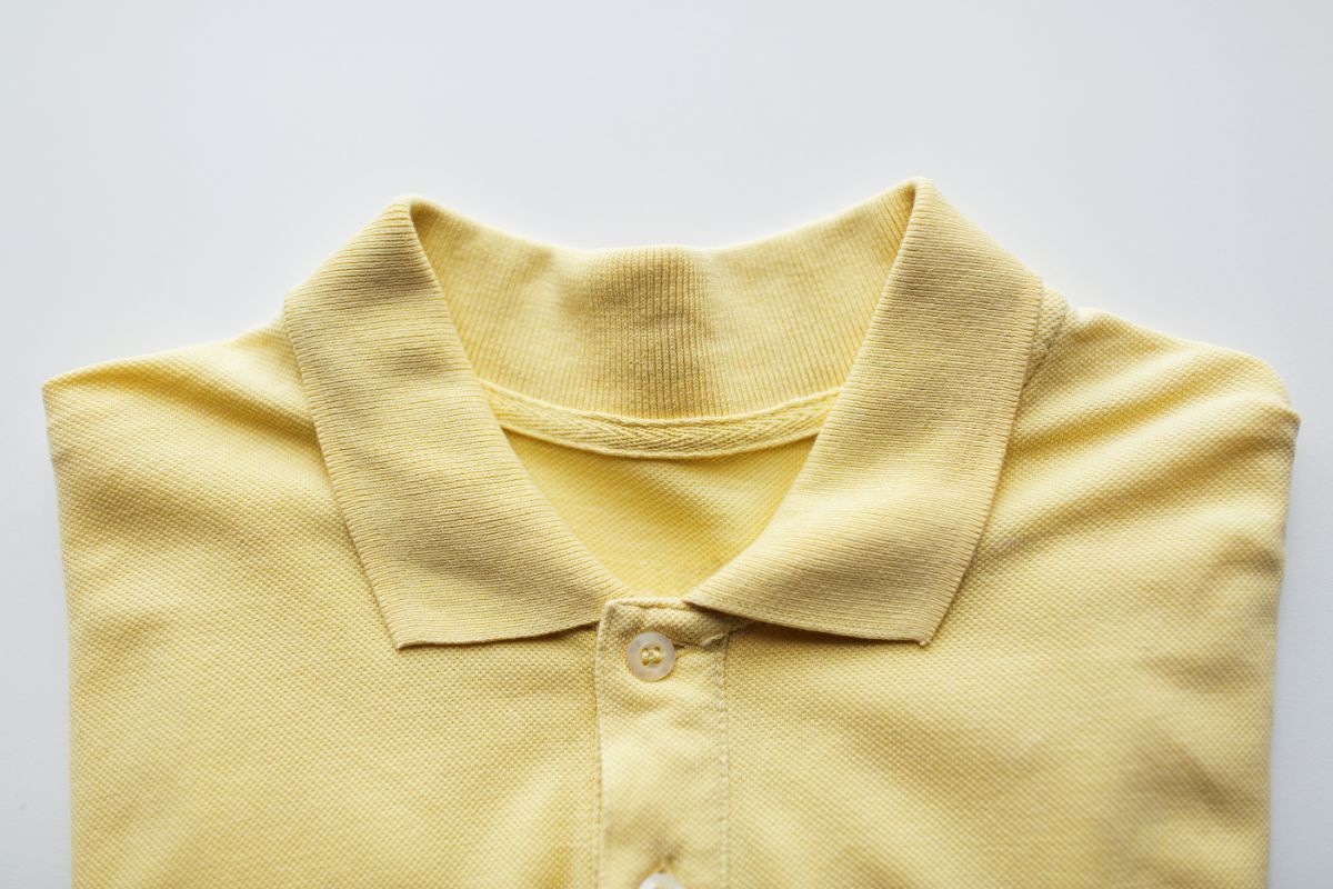
What are the tips for selecting polo shirt colors that represent your brand?
- Understand your brand identity
- Consider color psychology
- Incorporate official brand colors
- Ensure adequate contrast
- Factor in the environment and use case
Overview
- Selecting the right polo shirt colors is essential for reinforcing your brand identity and ensuring a professional, cohesive appearance.
- Considering brand values, color psychology, official palettes, contrast, and environmental factors helps you make informed decisions that align with your organization’s image.
- Thoughtful color choices ensure your polos effectively communicate your brand, enhance recognition, and leave a positive impression on clients, employees, and event attendees.
Choosing the right polo shirt colors goes beyond aesthetics—it ensures your brand is instantly recognizable and consistently represented. For corporate buyers sourcing uniforms or event apparel, the colors you select convey professionalism and reinforce your company’s identity.
From subtle neutrals to bold signature hues, each color choice communicates a message about your brand and values. Understanding how colors influence perception helps you make informed decisions that align with your organization’s image.
In this article, we explore practical tips for selecting polo shirts that can help represent your brand, guiding you to choose colors that reflect your company’s identity while maintaining style and cohesion across teams.
Understand Your Brand Identity
“Choose polo shirt colors that reflect your brand’s values and image—neutral tones for trust, vibrant hues for energy. Consistent apparel across uniforms, events, and promotions strengthens visual identity and prevents mismatched impressions
Consider the impression your team leaves on clients and event attendees. Cohesive color choices build credibility and foster a strong sense of brand identity. When you’re ready to make strategic decisions about polo shirt colors, we at Lifeline can provide expert guidance to ensure each shirt becomes a subtle but powerful ambassador for your organization.
Consider Color Psychology

Colors influence how people perceive your organization and its values. Blue communicates trust, professionalism, and stability, making it popular in corporate and finance sectors. Green signals growth, sustainability, and wellness, ideal for healthcare, education, or environmental initiatives.
Red conveys passion and energy, while black or navy suggests authority and sophistication. Aligning color psychology with your brand’s purpose ensures polo shirts send the right message to employees, clients, or event participants. In the Philippines, cultural color meanings should also be considered. Practical factors matter too—bright tones boost visibility outdoors, while muted shades maintain professionalism indoors. Combining psychology, culture, and context ensures your shirts always create the right impression.
Incorporate Official Brand Colors
Consistency is key when using polo shirts to reinforce branding. Choosing colors that match or complement your official palette strengthens recognition across uniforms, merchandise, and promotional materials. If the palette is limited to bold accent colors, pairing them with neutral bases and applying the signature tone as detailing on collars, trims, or logos is recommended.
Adequate contrast between shirt color and logos is essential for visibility and readability. Light shirts pair best with dark logos, and dark shirts with lighter logos, ensuring branding is clearly seen in photos, videos, or crowded events.
Considering the environment and use case helps guide color choices. Corporate settings call for polished shades like navy, charcoal, or white, while outdoor events benefit from bright colors that enhance visibility. This approach ensures polos perform well and consistently represent the brand.
Ensure Adequate Contrast
Readability and visibility are vital when polos feature logos or embroidery. Light shirts work best with dark logos, while dark shirts need lighter ones for contrast. Clear visibility ensures branding stands out in photos, videos, and events, while also reinforcing professionalism and brand credibility. This helps corporate buyers choose colors that balance style with maximum impact
Consider contrast not just for logos, but for trims, collars, and sleeve accents. Subtle design elements can support branding while keeping the overall look cohesive. Proper contrast planning ensures every polo communicates your brand effectively without clashing or appearing unbalanced.
Factor in the Environment and Use Case

Where and how polo shirts will be worn should guide color decisions. Corporate offices may favor refined shades like navy, charcoal, or white to maintain a polished appearance. Outdoor events or team activities benefit from bright, visible colors that keep participants easily identifiable.
Industry-specific needs should also influence your choices. Hospitality often uses warm, inviting tones, while tech or finance sectors lean toward modern neutrals or sleek monochromes. Considering context ensures the apparel supports both functionality and brand messaging.
Climate and local conditions matter too, especially in the Philippines. Lightweight, breathable fabrics in suitable colors improve comfort and ensure the team looks professional even in outdoor or humid settings. Combining practical functionality with brand alignment makes every polo a consistent ambassador for your organization.
Key Takeaway
Equipped with these tips for selecting polo shirts that can help represent your brand, you can confidently choose colors that reinforce your company’s identity, maintain visual consistency, and create a professional, cohesive look for staff or event participants.
Elevate your team’s professional image with Lifeline Shirts’ custom apparel. Our polo shirts are designed for comfort and durability, helping your staff look polished while representing your brand. Contact us today to explore our corporate wear options and find the right fit for your business.


